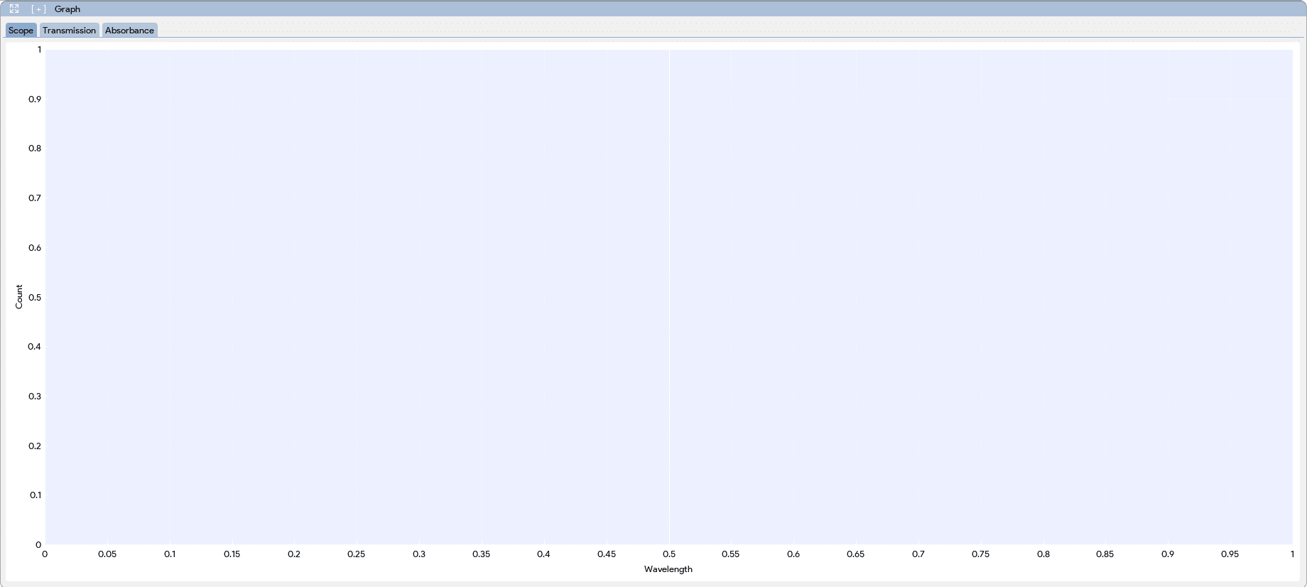
Every application supports different types of graphs generated by the spec. The user can click on the tabs in the graph window to switch among the available graphs for the application.
Graph Tools
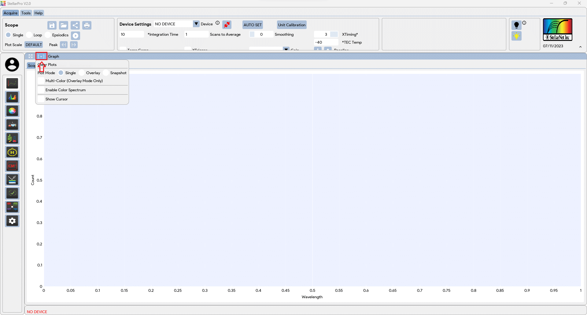
To display the graph tools menu, click on the located at the menu bar of each Graph Window. Note: The graph windows for each application are independent, therefore the graph tools applied in one application will not affect the graph in another application.
| Clear Plots: Click on the “Clear Plots” will remove all the plots on the graph window. | |
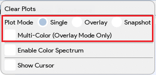 |
Plot Mode:
|
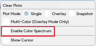 |
Enable Rainbow: Enable this feature will allow the visible light display on the plot for the incoming spectrum. This feature only allows for Single data capture. |
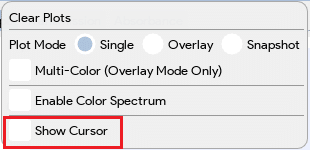 |
Show Cursor: Enabling this feature will display a cursor on the plot, and the information of wave, pixel, and value at the cursor will be displayed on the top right corner of the plot. Dragging the cursor will update the information accordingly. The cursor will also be enabled when Peak Finder Arrows are pressed. |
Graph Panel Controls
- Pan:
- Both X and Y axes: Left click and drag within the plot area.
- An individual axis: Left click and drag on an axis.
- Zoom:
- Zoom Region: Right click and drag
- Both X and Y axes: Scroll mouse wheel in the plot area.
- An individual axis: Hover axis and scroll mouse wheel.
- Zoom Extent / Auto fit all visible data: Double left click in the plot area.
- Auto Fit the individual axis: Double left click on an axis (X or Y axis).
- Show/hide plot items: Click on the legend label icons.
Graph Info
- “Scope” is designed to visualize the raw data obtained from the spectrometer. The data is typically represented as 16-bit values ranging from 0 to 65536. By displaying this data graphically, scientists can easily observe the intensity and distribution of the spectral peaks. Additionally, the software allows users to incorporate a dark reference, which helps eliminate any dark offset present in the measurements.
- “Transmission” This graph plots the relationship between light frequency (wavelength) and the amount of light transmitted through the sample under investigation. It utilizes the Beer-Lambert law, which relates the absorption of light to the concentration of the absorbing species in the sample. The y-axis of the graph represents the percentage of light transmitted, ranging from 0 to 100%. To accurately analyze the transmission data, both light and dark references are necessary for calibration and baseline correction.
- “Absorbance” focuses on illustrating the absorption characteristics of the sample. It displays the data as a plot of light frequency against the amount of light absorbed by the sample in arbitrary units (Au) typically in the range of 0-2.5. Similar to the Transmission graph, the Absorbance graph requires the use of both dark and light references for accurate measurements and baseline correction.
- “Watts” graph represents the power of light, encompassing irradiance, radiance, and radiant flux, per nanometer of the spectral range. This graph is generated by multiplying the NIST Traceable calibration values on the Y-axis with the spectrometric data. By visualizing the Watts graph, scientists can gain valuable insights into the power distribution and intensity of light within the specified spectral range, enabling them to analyze and interpret spectroscopic data accurately for a wide range of applications.
- “Lumen” graph, which provides information about the light output in terms of lumens and lux for the visible light spectrum. Lumens measure the total amount of visible light emitted by a source, while lux represents the illuminance of light intensity received on a surface per unit area. Similar to the Watts graph, the Lumen graph combines the calibrated values on the Y-axis, traceable to standards such as the International Commission on Illumination (CIE), with the spectrometric data. By visualizing the Lumen graph, researchers can gain insights into the light output and intensity in terms of lumens and lux for different wavelengths within the visible light range, facilitating accurate analysis and interpretation of spectroscopic data for applications related to lighting design, display technologies, and visual perception.
- “PAR” (Photosynthetically Active Radiation) graph, which measures the light intensity in terms of micromoles per square meter (µmol/m²) within the range of wavelengths that are most effective for photosynthesis. PAR represents the light energy available for plants to drive photosynthetic processes. This graph is generated by multiplying the calibrated values on the Y-axis, which are typically based on standards like the McCree curve or the Photosynthetic Photon Flux Density (PPFD), with the spectrometric data. By visualizing the PAR graph, researchers can assess the intensity and distribution of light energy in the photosynthetically active range, enabling them to evaluate and optimize light conditions for plant growth, cultivation, and indoor farming applications.